

- The catalog of available chart types to represent your data visually.
- Options for switchable encodings that allow you to adjust axis assignments, filters, and aggregations.
- Built-in interaction options to customize queries and validate results.
- Key accessibility features designed to make Dashboards approachable for all users.
Graph / Chart Catalog
WisdomAI’s Dashboards support a variety of chart types to represent data insights effectively. Users can select the desired chart type through a dropdown menu in the Editor tab.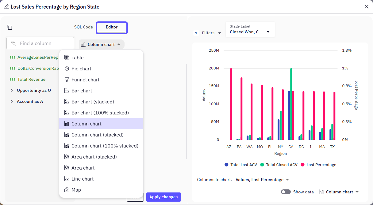
Available chart types
These visualization options enable users to tailor the presentation of data to their specific analytical needs. Therefore, selecting the optimal chart depends on your data, the message you want to convey, and your audience. Always consider what insights you want to highlight before picking a chart type.
Switchable encodings
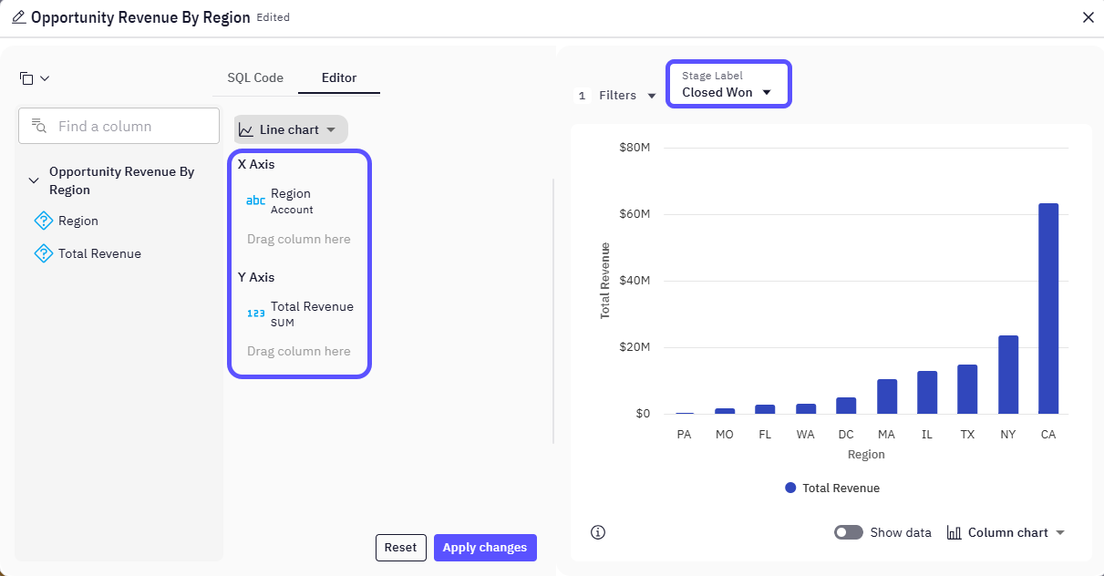
Within the Editor tab, users can customize data encodings to refine their visualizations, for example:- Axis Assignment – Drag and drop data columns to assign them to the X and Y axes
(e.g., “Region” on X-axis, “Total Revenue SUM” on Y-axis). - Data Filtering – Apply filters to focus on specific data subsets
(e.g., “Stage Label: Closed Won”). - Aggregation Functions – Use SUM, AVG, etc., to aggregate numerical data as needed.
Interaction options
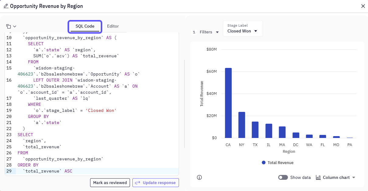
WisdomAI provides interactive elements to enhance user engagement and data exploration:- Editable SQL – Modify the generated SQL queries in the SQL tab to correct or fine-tune results.
- Feedback Mechanism – Give a thumbs up or down to improve future AI responses.
- Review & Validation – Mark queries as reviewed to confirm accuracy in team workflows.
Accessibility notes
WisdomAI emphasizes accessibility to ensure a wide range of users can effectively engage with Dashboards:- Natural Language Interface: Ask questions using plain English to generate data queries.
- Visual Configuration Tools: Use drag-and-drop components in the Widget Editor to configure visuals without writing code.
- Collaborative Integrations: Access insights directly from platforms like Slack or Teams, supporting seamless workflows.
- Color Accessibility: WisdomAI Dashboards meet WCAG 2.1 AA contrast requirements, ensuring chart colors are distinguishable for users with color vision deficiencies. You can also prompt the AI to adjust chart colors to better suit your needs.
Next steps
Dual-Axis Charts
Plot two metrics with different scales on the same chart.
Build Dashboards
Compile your favorite charts and visualizations into a shareable dashboard.