How it works
The system uses specific detection methods and structural components to build these rich visualizations.Detection methods
The system identifies the need for a dual-axis chart in two ways:- Rule-based: It recognizes keywords such as “combo chart,” “dual axis,” or “dual-axis” in your query.
- LLM-based: The AI automatically detects when requested measures use different scales or have different semantic meanings.
Chart structure
Each dual-axis chart is built using a specific layout specification:- Dual Y-axes: Independent scales are provided for both the left and right Y-axes.
- Multiple Series Types: Each measure can be rendered as a COLUMN (vertical), BAR (horizontal), LINE, or AREA.
- Layout Mapping: The system explicitly defines what data appears on the X-axis, which measures belong to each Y-axis, and the rendering position for each series. The chart structure is defined using ChartLayoutSpec, which includes:
- x_axis.columns[] - What goes on the X-axis
- y_axes[].columns[] - Measures per Y-axis
- y_axes[].series_type - How to render (column/line/bar/area)
- y_axes[].position - Left or right axis
- series_dimension - Dimension for colored series grouping
Key capabilities
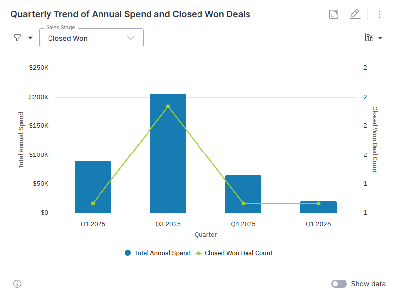
Dual-Axis Charts allow you to perform advanced analysis within a single visualization:- Compare Different Scales: View metrics with entirely different units, like transaction volume and conversion rates, in one place.
- Mix Visual Styles: Combine bars and lines to distinguish between volume-based data and efficiency-based trends.
- Consolidate Insights: Replace multiple standalone charts with a single visual that tells a more complete story.
Common use cases
| Metric A (Bars/Area) | Metric B (Line) | Purpose |
|---|---|---|
| Revenue | Margin % | Compare absolute profit to efficiency. |
| Transaction Volume | Conversion Rate | Track activity alongside success rates. |
| Pipeline Size | Win Rate | Monitor potential revenue against closing effectiveness. |
| Spend | ROI | Visualize investment against return levels. |
Targeted users
This feature is available to Explorers and Admins.FAQs
Do I need to configure axes manually?
Do I need to configure axes manually?
No. The system automatically chooses the appropriate axes and chart types based on the detected metrics.
Can I mix different chart styles?
Can I mix different chart styles?
Yes. Combo charts can combine bars, lines, or area series within a single visualization.
When should I use a combo chart?
When should I use a combo chart?
Use a combo chart when you need to compare metrics on different scales or when you want to see how two distinct trends relate.
Will this work with time series data?
Will this work with time series data?
Yes. Dual-axis charts are particularly effective for making time-based comparisons across multiple metrics.
Next steps
Visualization Types
Explore the full library of chart types and properties available in WisdomAI.
Knowledge Playground
Experiment with different queries to see how the system generates dual-axis charts.